cIn this article we are going to look at how easy it is to create an interactive Chart from a finance API on RapidAPI, without writing any code.
After the Chart is created, you can then embed it onto any website by simply adding 2 tiny snippets of embed code. Once the Chart is embedded on your website, it will automatically stay updated with the latest data from the API at the interval that you select.
The Chart will be responsive, interactive and styled exactly how we want it. It is NOT a static image chart.
What is RapidAPI
RapidAPI (now called simply Rapid) is the world’s largest API hub that has over 40,000 public APIs that you can use with a single API key.
You simply need to sign up to get your API key which can then be used to connect to any of the APIs listed on their marketplace. Most APIs will have a free plan which will give you a limited number of calls each month. Often the free plan is enough.
Let’s look at how we can easily create a financial chart from an API on Rapid.
Select our Finance API
You can browse the Finance category on Rapid which lists around 1,000 different finance APIs: https://rapidapi.com/search/Finance?sortBy=ByRelevance
The Finance category on Rapid looks something like the below.
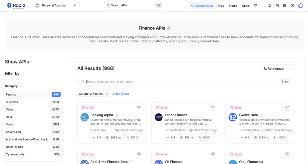
We will use the Yahoo Finance API which is shown as the second API on the list. After clicking on this, we are taken to the APIs page where we need to ‘subscribe’ to the API.
There is a free plan which gives us 500 API calls per month, which will be plenty. After subscribing, we can now test out the endpoints from the panel on the left.
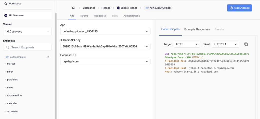
We’ve selected the stock > stockGetChart endpoint as that sounds pretty appropriate for creating a chart. This endpoint will give us the open, close, high, low & volume for a stock that we choose.
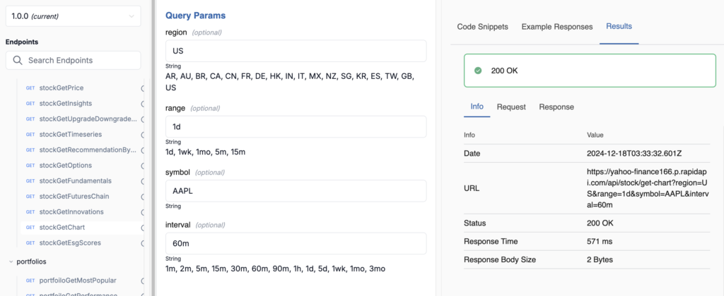
In the screenshot below you can see the parameters that we are using:
- region: US
- range: 1d
- symbol: AAPL – this will return the prices for Apple
- interval: 60m
And you can see the URL in the right panel that is now created from these parameters. This is the URL we will use to connect to this API and get the data: https://yahoo-finance166.p.rapidapi.com/api/stock/get-chart?region=US&range=1d&symbol=AAPL&interval=60m
Connecting to the API
This is usually the part where you would have to do some coding to connect to the API. The code to connect to the API could be written in PHP or Javascript if you are using it on a website.
Using API Widgets, we can simply add the URL of the API (which we saw above) and our RapidAPI key into the fields provided. To do this, we simply click the Builder link at the top of the page at API Widgets, which will bring us to the page shown below, allowing us to build a new Widget.
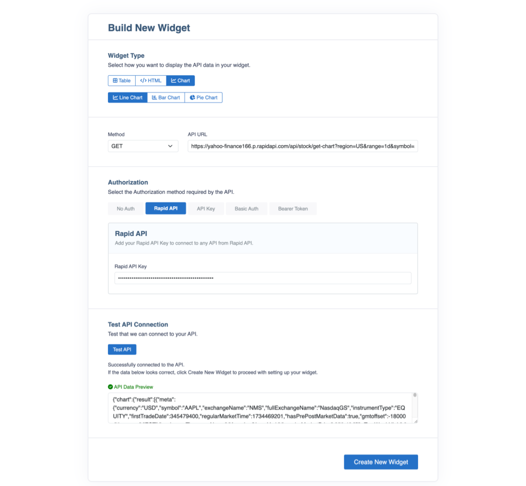
Our settings for the new Widget look like this:
- Widget Type: Line Chart
- Method: GET
- API URL: https://yahoo-finance166.p.rapidapi.com/api/stock/get-chart?region=US&range=1d&symbol=AAPL&interval=60m
- RapidAPI Key: the key provided by RapidAPI
With all these details filled in, we click the Test API button and if we get a green tick we can then proceed to click the Create New Widget button.
And that’s all it takes to connect to the API and create a Widget. Now we need to configure the Widget and style our Chart.
Configure the Chart
After connecting to the API and clicking the Create New Widget button, we can see our JSON API data in the left panel.
We now need to scroll down to find the timestamp node which contains the array that will become the x Axis (horizontal) data. The Chart is going to be a timeseries Chart, so each timestamp will represent a ‘tick’ on the x Axis.
Click on the timestamp node and it will become highlighted.
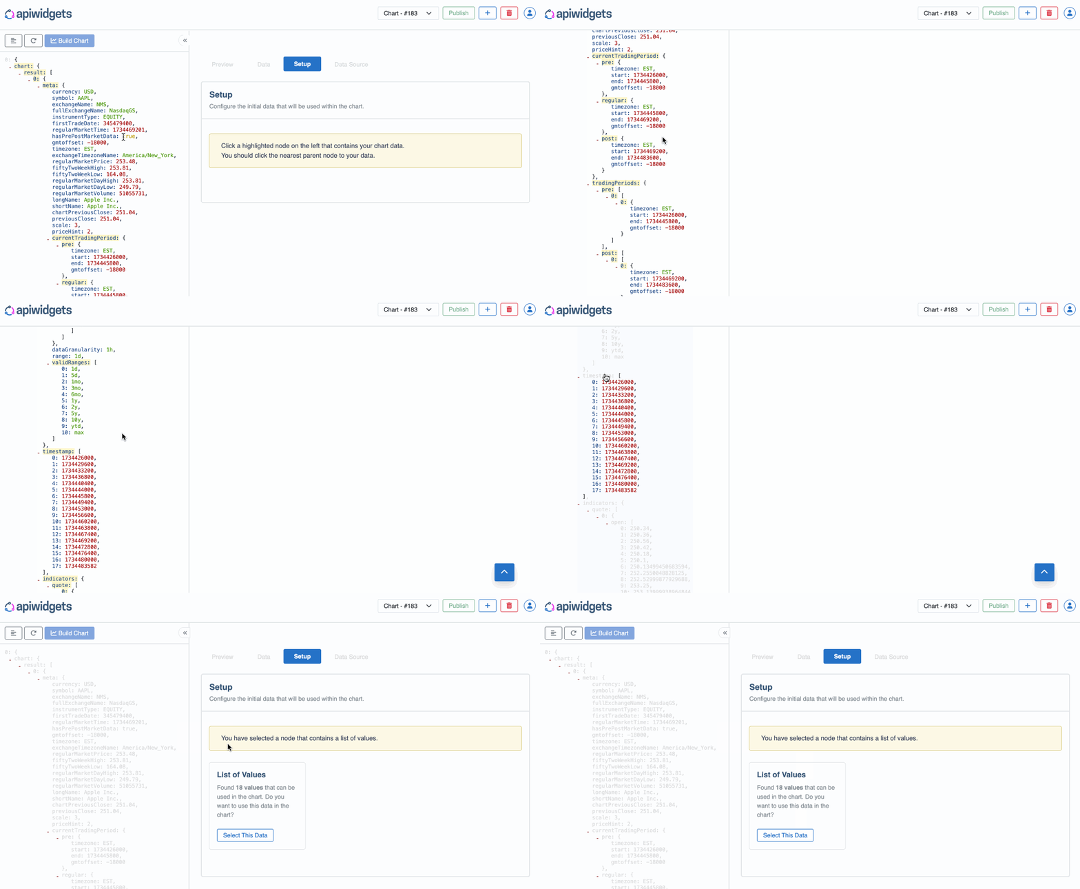
We can then click on the Select This Data button, followed by the Build Chart button and we will see that we now have a Chart, ready to be customized.
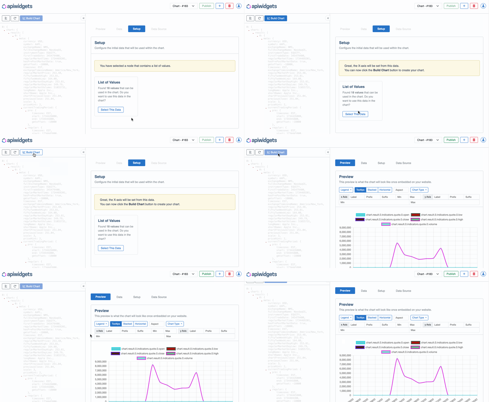
API Widgets has automatically recognised that the timestamp node contained an array of items, so it has crawled through the JSON data and extracted all other arrays with the exact same length and used these matching arrays as our datasets.
Customizing the Chart
We have a Chart but now we want to customize the look of the Chart.