In this article we will look at how easy it is to create a beautiful looking chart using the Polygon API, without writing any code.
The chart is a fully featured chart that uses chart.js – it is not a simple image chart.
We can then embed the chart onto any website, and the chart will stay updated with fresh API data at the interval that we choose.
Polygon API key
The first step is to register at polygon.io and get your API key as shown below.
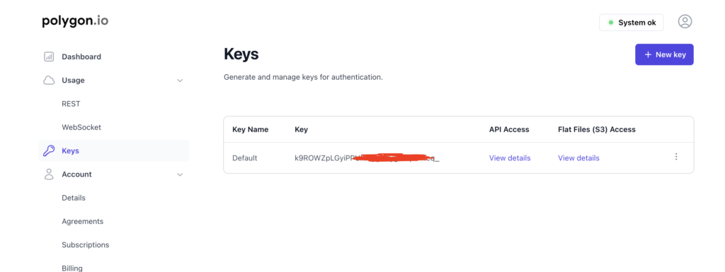
Connect to Polygon API
Next we visit the Converter tool at API Widgets and add the URL for the Polygon API endpoint we are using. In this case we are using the Aggregates endpoint and getting data for the crypto pair BTCUSD.
Here is the info for this API endpoint: https://polygon.io/docs/crypto/get_v2_aggs_ticker__cryptoticker__range__multiplier___timespan___from___to
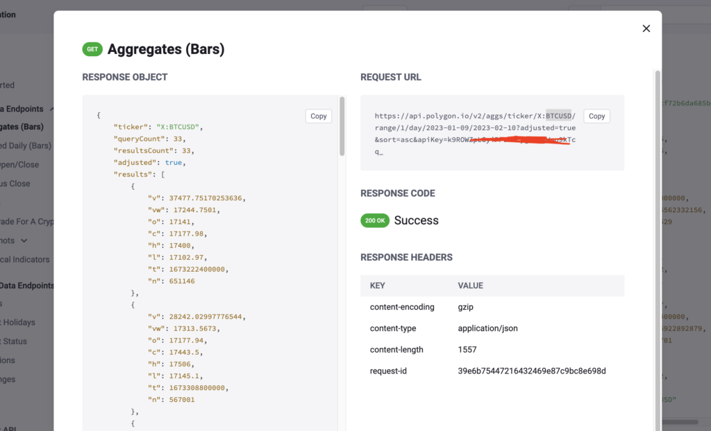
Polygon gives us the full URL that we need to connect to as seen in the Request URL section. Copy this URL and paste it into the URL filed at the Converter as shown below.
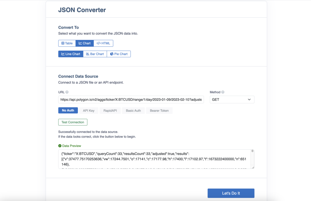
We want to create a chart from the Polygon API data, so we have selected a Line Chart within the Converter tool.
We now hot the Test Connection button to make sure that we can connect to the Polygon API successfully. After the successful test we can see our Polygon data.
Now simply hit the Let’s Do It button and you’ll be taken to the Converter where we can create the chart.
Create Chart from Polygon API data
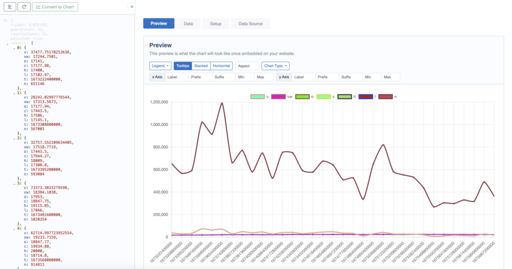
You’ll now see the JSON data from the Polygon API. All we need to do is click on the results node in the JSON. This node is the uppermost node that contains all of the data we want to use in the chart.
After selecting this, it gives us 2 options: Outer List and Inner Items.
Within the Inner Items options, the t represents a timestamp, so we want to select this and this timestamp data will become the items on the x Axis.
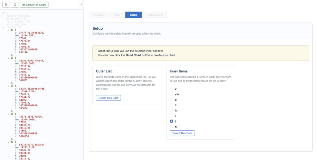
After selecting t and then clicking on Select This Data, we can now click the Convert to Chart button which creates our chart.
We can see that it has set the timestamp on the x axis and has captured all the other data and added these as datasets, or lines on the chart.
Modify the Polygon API Chart
After creating our chart from the Polygon API, we will want to modify it to show the data we want. We can do this by going to the Data tab and then using the options there to update the labels or change colors etc. We have simply removed a couple of the datasets and renamed them so that our chart now looks like this.
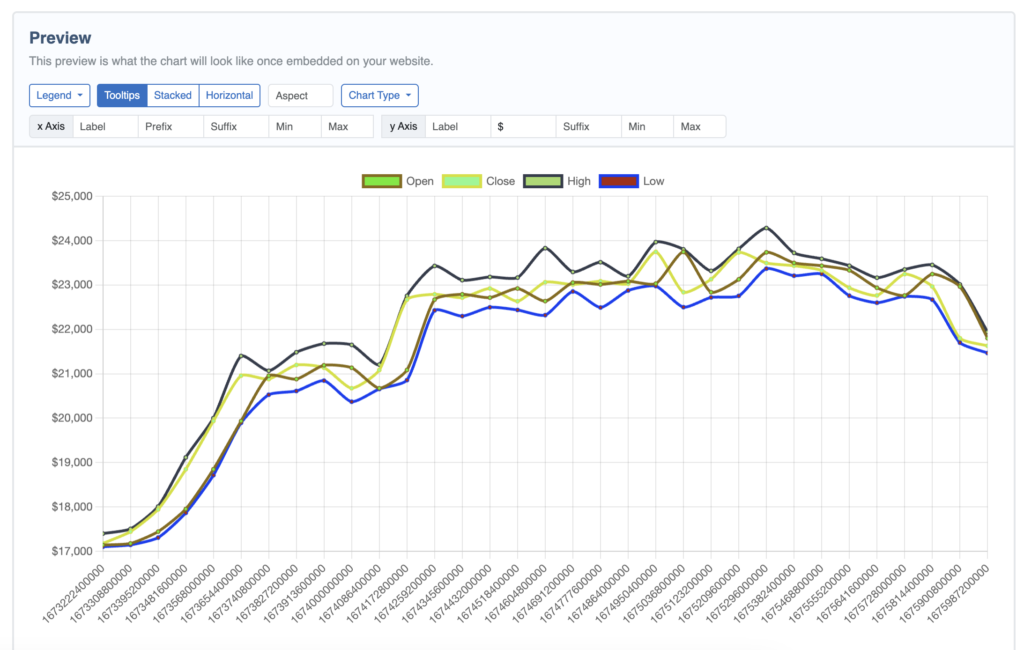
There are other modifications we can do, but for now this looks pretty good.
Embed the Polygon API Chart
Now that we have the chart, we want to embed it into our website. To do this we simply click on the Embed button at the top of the page and this popup will appear.
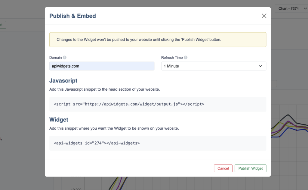
We add the Domain where we will be embedding the chart and select the Refresh Time. The Refresh Time sets how often the chart should be updated with new data. All of the modifications we made to the chart will remain the same, it will just be the Polygon API data that is updated and refreshed.
Now we just copy the 2 lines of the snippet code and add this to the website.
The Javascript snippet should go into the head section of the webpage we are embedding it on and the Widget snippet will be pasted wherever we want to to display the chart.
And that’s it.
You will now have an auto-updating chart that uses the Polygon API.